
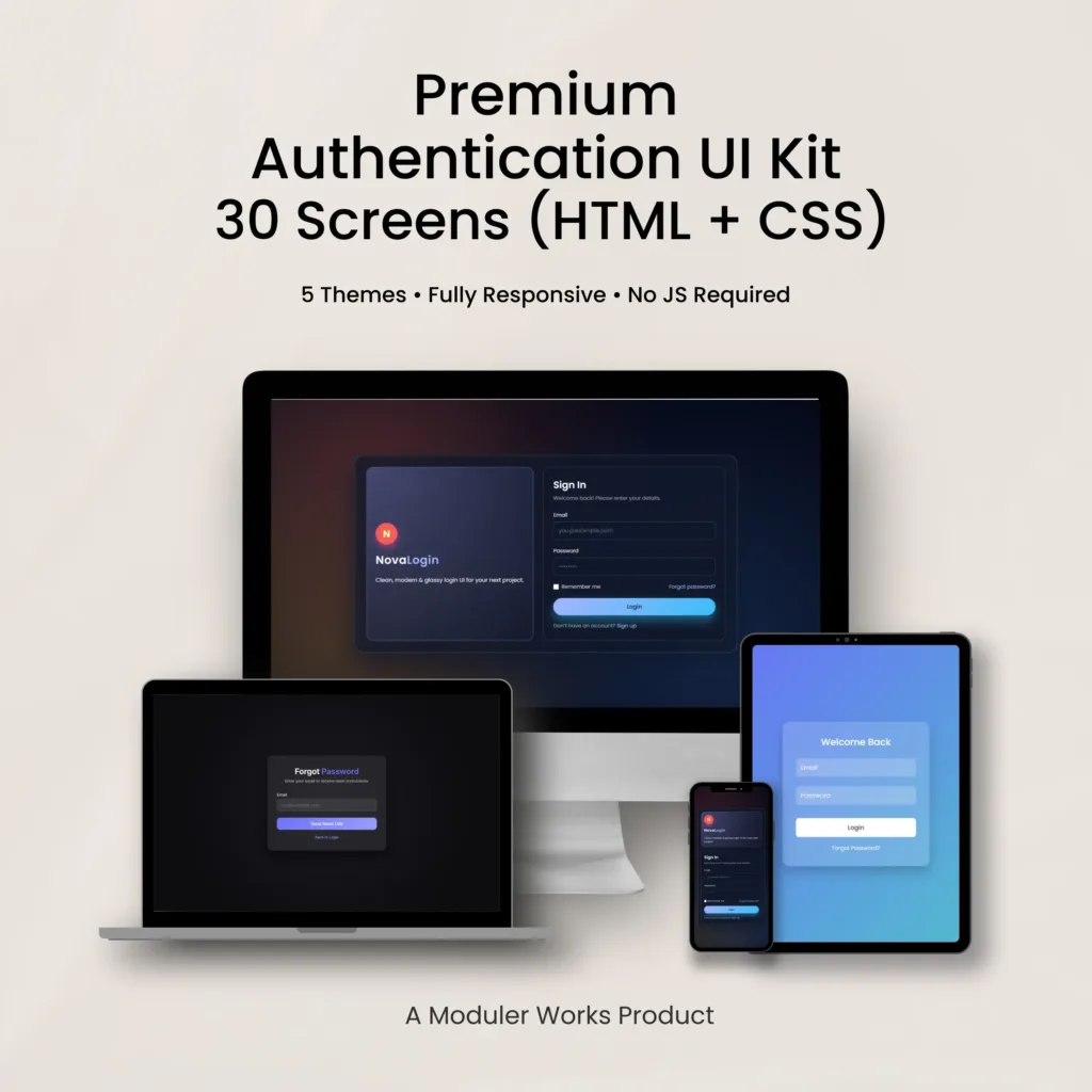
Premium Authentication UI Kit
30 Ready-to-Use Screens · HTML + CSS
Clean, modern, and fully responsive authentication screens designed for real-world web applications. Built for speed, clarity, and seamless integration.
Overview
A carefully crafted authentication UI kit focused on clarity, usability, and modern design standards.
Designed to help teams build consistent, scalable authentication flows with minimal effort.
What You Get
Everything you need to implement clean, modern authentication screens in your next project.
Why This UI Kit
Carefully designed features that make this UI kit easy to use, flexible to customize, and ready for production environments.
What’s Inside
A complete set of thoughtfully designed authentication screens covering the most common user flows in modern applications.
Screen Previews
A curated overview of the authentication UI across themes and states.
Authentication UI — First Impressions
A visual introduction to the authentication experience, focusing on atmosphere, layout,


Color System
A functional color palette designed for clarity, accessibility, and scalable UI components. Optimized for dark-mode interfaces and modern product environments.

Typography System
A balanced typography system designed for clarity, hierarchy, and modern UI workflows. Uses Inter for interface text and Poppins for display typography.
● Inter — Interface Typeface
Used for body text and UI elements, prioritizing readability and consistency.

● Poppins — Display Typeface
Used for headings and emphasis to create visual hierarchy and character.

Inside the Kit
A breakdown of the components, features, and screens included in the authentication UI kit.
● Inside the Kit — Overview
An overview of the kit structure, screen groups, and overall system layout.


● Features & Capabilities
Key features and technical characteristics designed for real-world implementation.


Theme Login Screens
Five authentication themes presented through mobile and web login screens.


Theme-Based Authentication Screens
Each theme includes a complete set of authentication screens beyond login.


System Feedback Screens
Global success, error, and confirmation screens shared across all authentication flows and themes.


